
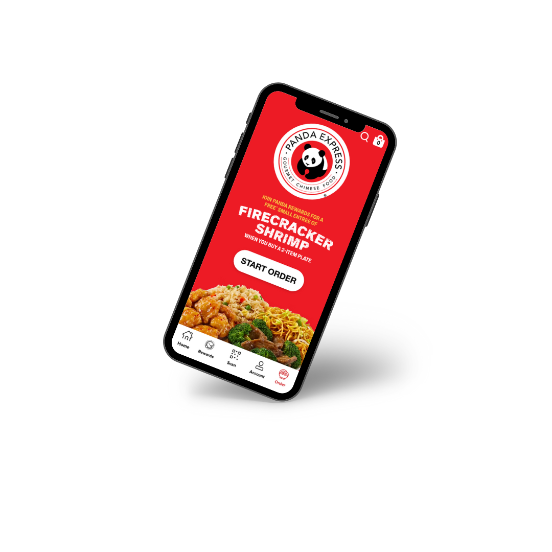
Panda Express is beloved for its fast and flavorful Chinese-American cuisine, but its mobile app left much to be desired. The cluttered design and confusing navigation frustrated users, making what should have been a quick ordering process feel unnecessarily complicated. I set out to change that, redesigning the interface to simplify and enhance the overall user experience.
Understanding the Problem
When I first evaluated the original app, it became clear that the overstimulating homepage, inefficient navigation, and difficulty in finding critical information—like allergens or calorie counts—were the biggest barriers for users. Whether it was Sarah, a busy college student managing dietary restrictions, or Maggie, a working mom trying to satisfy her picky kids, the app slowed them down and made ordering feel like a chore.
My Approach to Improving the App
To better understand user frustrations, I conducted usability tests where participants completed tasks such as ordering a bowl with fried rice and orange chicken or finding allergen information. The results highlighted three main issues:
- Overstimulating interface
- Poor organization of menu items
- Hard-to-access nutritional and allergen details
Using these insights, I focused on a user-centered redesign:
- Streamlined navigation: I replaced rows of text-heavy options with square icons that visually group items into categories like “spicy” or “premium.”
- Simplified homepage: The new layout reduced clutter, highlighting key features while eliminating unnecessary distractions.
- Improved accessibility: I added larger text sizes and nutritional pop-ups, making the app easier to use for everyone.
Testing the Results
After completing the prototype, I ran follow-up usability tests with the same participants. The redesign proved to be a success—users completed their orders faster and found the interface much easier to navigate. By introducing consistent visual indicators and intuitive pop-ups, I created a design that felt more user-friendly and polished.
Want to know more about wireframing? Check out this helpful guide here.
Reflections and Next Steps
This project showed me the power of prioritizing user needs in design. The redesigned app not only functions better but also delivers a more enjoyable ordering experience. If these changes are implemented, they could set a new benchmark for fast-food mobile apps.
Moving forward, I’d love to extend this design system to other menu categories and improve item visuals for clearer size differentiation. If you’re interested in exploring app redesigns, dive into this guide to UX research or learn why accessibility matters.
By addressing common frustrations, this redesign aims to make ordering from Panda Express as smooth and satisfying as their signature orange chicken.
Click here to check out full redesign and case study!
No responses yet